The Seven Principles of Landscape Design
Hello, my fellow landscape enthusiasts! Today seemed like as good a day as any to explore the Principles of Landscape Design. We’re going to talk about the standards used to create, measure, discuss and evaluate our landscape designs.
We’re going to start with creation; the backbone of the design process. How do you create a great landscape? A beautiful, functional outdoor space? Really, it’s all about problem-solving, and it starts with identifying the problem. I tell all of my landscape design and landscape architecture clients that when we are designing a landscape, we are the problem-solvers, we’re solving a problem for them. The problem could be as simple as they want a beautiful backyard that they can show off to friends and family. Or it could be as complex as solving an eyesore drainage problem. Regardless, it starts with a problem and the first step is to identify that problem. The only way to identify the problem is through consultation; meeting with clients and having great, detailed conversations about what they’re trying to achieve. Second, to this, we conduct a site inventory/analysis to make sure we capture the measurement and dimensions accurately to start producing the design. And lastly, we present the solution to the problem back to the client in the form of landscape design.
How good the design is, depends on who well the basic design principles are incorporated and applied. Funnily enough, most people have an inherent visual sense of the basic principles of design. They may not know what they’re explicitly called or even how to describe them, but they’ve seen them before in the world all around them. They’ve seen them in action and it’s become natural, whether they’re aware of it or not. I see it in the faces of my clients when I deliver them a cracking landscape design. It never fails to give me a kick, and the joy of solving problems beautifully is exactly why I get out of bed every morning.
So applying principles of design. Apply the design principles to all levels of exploration in the landscape. Try to use as many of them as you can. Within your cone of vision, that is the area that’s going to fall within the line of vision. So basically my cone of vision is what I can see to the left, to the right, and down through my cone of vision. Consider the macro range or the most distant view, and then the micro range which is what’s closer to me. You still want to apply the principles to the macro views. And then you want to apply them to the micro views. You want to be able to see design principles throughout your cone of vision. So, what are these magical seven principles of design??
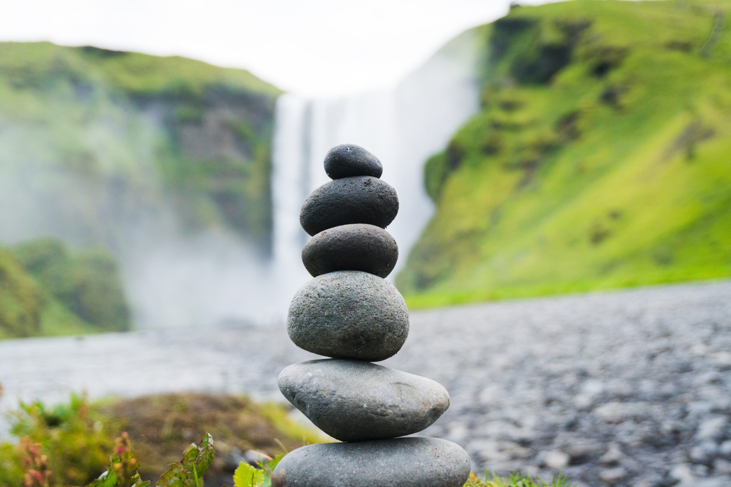
Great landscape designs all start with “Balance”
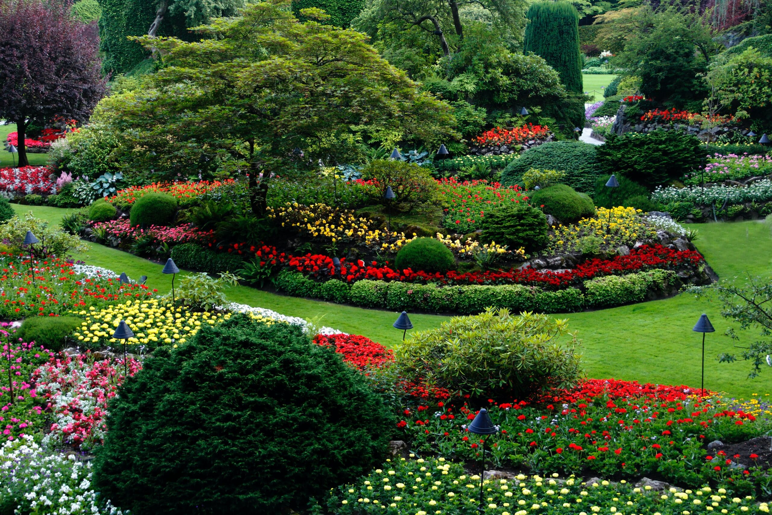
Does the left side match the right side? Does the front match the back? Balance is a state of being. There are three types of balance. We have symmetrical. We have asymmetrical. We have proximal and distal. And with symmetric, symmetric is really, it’s a mirror image of what’s on the left to what’s on the right. Asymmetrical I kind of describe it as you have stuff on the right, you have stuff on the left. They might not be exactly the same but they just feel balanced. Either it’s two smaller trees that equal one larger tree on the right. It’s not a mirror image. And then we have proximal balance, things that are further out, are they balanced to things that are closer to you, closer meaning proximal and distal being further out again. The meaning of those two can be confusing, but proximal is close to you, and distal is further out. Is there a balance in between there? Symmetrical balance, again, it’s formal balance. We’re going to see this more in our English type garden settings, everything that’s based with hard lines matches from the left to the right, it’s that mirror image of the opposite side. And each side is pretty much split down a central axis, it’s exactly the same. It’s matching, a mirror image. You can peel the landscape over from the left and fold it back over onto the right and it will match up perfectly.
Now with asymmetrical balance, the weight is balanced, but it’s not a mirror image. Perhaps we use shrubs on one side fo the landscape, and a tree on the other. If done correctly, the weight of the greenery is evenly distributed and balance is achieved despite the use of completely different plant material. And that’s what we’re going to call asymmetrical balance. It’s still balanced but it is not identical, it’s not a mirror image. Asymmetrical balance is informal. Plants should be irregularly placed on either side of an imaginary axis. Mass or weight on either side of the axis appears to be balanced. Again, you’re not feeling like one side’s heavy and the other light. It’s matched. It’s matched per weight. You feel that weight difference. Curved lines, obscure and merging edges and natural contours identify asymmetry in the garden.
Proximal and distal balance is an asymmetric balance that deals with the depth of the field of vision. Near and far balance are included in addition to the left and right. You need to consider off-sight features. It could be a competing focal point in a neighbours garden or backyard or a beautiful mountain backdrop, regardless, you will need something proximal (close) tp balance the weight of features of something in the distal (distant) background. Proximal and distal balance in your landscape.
Great landscape designs have a “Focal Point”
Focalisation of interest; better known as a focal point. Each landscape design needs to have a focal point. If it’s a front yard that we’re designing, the focal point could be the front door. It could be a stunning water feature or a swing seat hanging from a gorgeous oak tree. It completely depends on the space that you’re working with, but, it needs a focal point.
Anything well-designed has a focal point where viewers eyes are first attracted. Boom, right to it. It could be this time of year a tree that’s turned bright yellow right before the leaves fall, something like a Japanese maple, something that’s very unique, usually it’s just one specialty tree that’s in an area is what we use for our focal points. You select and position visually strong items onto the landscape composition. The focal points may have any of the following or a combination of plants, hardscapes, architectural elements, colour, movement, texture. Bad designs tend to overuse the focal points. They may have three or four, whereas you really only need one. I like to do one close to the front door which kind of brings the eyes to the front door and actually leads my client’s guest to their front door because that’s what we try to do as a designer, from the front yard get the clients to the front door. Focal points should be placed where attention is naturally drawn, a public/common area, or the entryways. Golden rule though, do not place anything in a public area that will compete with the entry to the place. You want to accentuate it, bring their eyes to that focal point which will naturally draw them into the entrance. Whether it’s the entrance to the building, the front door of someone’s home, you want to get them inside the building.
The question is where you want to draw this attention? It doesn’t necessarily have to be plant materials. Again, it can be a water feature, a water feature or a birdbath or anything eye-catching that can steer the attention in the right direction.
Great landscape designs are “Simple”
Simplicity, are we designing it simple enough that people can understand it? Don’t overcomplicate it. I actually tell my clients, sometimes you just have to start drawing. You have to see it on paper to realize that it’s not going to work or that it is going to work. The paper that we use and a sharpie are two of our biggest design tools that we could ever have. We solve all kinds of problems with those two inexpensive tools. Don’t overcomplicate it. Simplicity. Cluttered and fussy landscape cause people to feel uncomfortable. Avoid too many species, textures, too many curves, too many colours, too many shapes, too many angles. Arrange the plants so that they create a silhouette. Again, don’t have too many species of plant materials. Use a combination of a few, but use several of one species instead of having a whole landscape design of 50 different plants. Use a handful of plants but use several of each type to create more of a simple plan. Simplicity means understanding what is and what is not important in landscape design. Details that will not have a major impact on the landscape are omitted to keep it cluttered. Sometimes you can over detail your plant material. Sometimes you can overdesign an area.
Great landscape designs have “Rhythm and Lines”
And then we have rhythm and lines. Does the project have a rhythm? Does it have line? Is it proportioned? Is one side too heavy or the other? And do we have unity? Can we bring it all together? Unity meaning like are we using the same type of stepping stone in the project to kind of bring everything together? Rhythm and line. Rhythm is to use repetition within standard intervals. Rhythm is expressed through the placement of plants, outdoor furniture, either individually or as a group. So we can use structural repetition that we can use the same benches throughout a park. It makes you feel like you’re part of the same place. Can be the same light post. You ever drive down a neighbourhood and see the same mailboxes? The developers required that everybody have the same mailbox or the developers require that everybody has a gas lantern or electric streetlight in their yard. They’re keeping it the same to maintain a pleasing rhythm. Pattern repetition. We could actually use sidewalk patterns. It could be a type of brick pattern that we use throughout. It could be every so often we use a different coloured stone that keeps that repetition going and you feel like you’re part of the same place.
Lines. They establish the shape or form of the landscape. Lines are created where different materials meet. We can have hardscapes and turf. We can have turf and planting beds. One of the simplest things that we can do for a client that has had their property neglected for several months or even several years, you can go in clean it up and expose some edges, some lines. Actually taking a bed edger or even if you got to use a spade or a shovel and you cut a hard line and you pine needle and mulch it and you roll those edges under and you tuck it real nice, that line gives you that separation between turf and mulch beds, will do more for that client than they really can imagine. Say they don’t have enough money to do a completely new landscape. Just going in and cleaning up the place and putting crisp lines and separating the turf from the planting beds or the hardscapes from the turf will do wonders for that client. And the strongest and most dominant lines are the lines of a house. So accent it, repeat the lines and angle of the house. It will work with your landscape design. Informal, curvilinear design. Lines should be dramatic, done with a sense of flamboyancy and expressive in their nature.
Rectilinear lines, straight hedge, edges of paving materials. They suggest quick, direct movement, get the traffic through the area and possibly get it to that front door. Angled lines can create opportunities for creating the bones or the framework of the landscape. And then lines that interconnect at right angles create an opportunity for reflection, stopping or sitting. So when you do have those right angles, that’s where you’d want to put a park bench or some outdoor furniture. You may want to put a little area to sit, picnic tables, just in an area that the people could actually hang out.
Great landscape designs have “Composition and Contrast”
Landscapes with great composition are easily understood. They’re easy to follow, everything is in shapes that we’re used to seeing, hard lines are squared off. There’s not really any curvilinear design that we’re used to seeing in the neighbourhoods of today. Again, I base this on an English style garden. Plants are frequently clipped, meaning that we’re talking hedge clippers. We’re keeping everything real formal. We’re giving it that military buzz cut to the plants. Not my favourite thing to do but there are times when it’s appropriate that we use hedge clippers and that would be in a formal garden setting for composition. Lines tend to be straight and the edges are clearly defined. You’re going to see metal edging underneath those boxwoods to keep those perfectly straight lines and keep that rock dust in the path. Real formal, immaculate. It’s not what I’d want to have for my front yard personally, but it’s something I may want to have in a private garden and in the back. It’s commonly seen in large campuses and things of that nature. But really easy to layout. It would probably be one of my favourite properties to do irrigation for versus some of these curvilinear jobs that we’ve had. But again, just think of hard lines and what I like to call very delineated military-looking formal English gardens.
I guess one of my biggest pet peeves is when we start talking about colour. Now, this is one of the principles we talked about, but what really gets me is we have a brick house. We have a red brick house and we do red brick pavers in front of it. I don’t like it. I need contrast. So if I have a red brick house, I would want more of a natural colour concrete paver, maybe brown, dark brown or just white concrete. Another thing, one of my pet peeves is plant material that clashes with the brick. I love a brick home, don’t get me wrong, but I’m going to use something other than red trees in front of red brick or red shrubs in front of the house. I’m going to use more of whites, more of yellows, colours that are going to stand out against the red brick.

Great landscape designs have “Proportion and Scale”
Proportion and scale. The size of the relationship between landscape features. Let’s not have something way, way too large. Do we want to plant a willow or oak that’s going to get really, really huge and have a low, small single-storey house? Or do you want to do it with something that’s going to grow a little bit slower and actually be more proportioned vertically? The same thing with horizontal. Do we want to plant, again, with that small house, do we want to plant a huge foundation planting that’s going to cover it and you’re going to have to keep pruning it because it’s going to grow taller than the house? Or do we want to have this real two-storey or two and a half storey house and we plant little bitty shrubs that will never get any size and it’s going to look proportionately just way off in our design? No, we want to have those spatial relationships. So when we’re designing a client’s property and we’re doing a front foundation planting, they’re going to pick their corner plants that are going to be the corner plants, they’re going to pick out the size, they’re going to pick out the shape, the width of the plant that it’s going to get the maximum height, and then they’re going to do the shrubs in between, what size plant material that they want, what size plant tree that they want in the front yard. They want it to be a 40-foot spread tree or they want it to only be 20-foot? Do they want a tree that’s going to grow 30 feet maximum height? Or do they want one that’s going to get 50 feet? They pick the sizes of the height and width of the plant material, and then they pick out the shrub and the plant material that’s going to fit their specifications that they want. Bring the canopy down in stages. Have your tallest plants, then your intermediate, and then your lowest. Bring it down in stages. Don’t do it all at once. The height of the viewer should be considered. Children’s perspective of the landscape is very different from an adult, so what’s big to a child may be smaller to us. We need to take that into consideration, especially for a design for a client with smaller children.
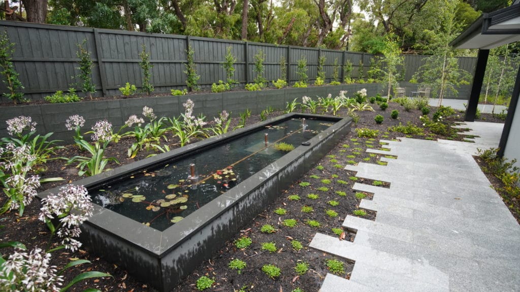
Great landscape designs have “Unity”
Unity. All the separate parts contribute to the total design. It gives the landscape design a sense of oneness and interconnection. You can have different gardens but if you have the unity within each garden, it brings it all together. Unity in landscape design can be achieved by using plants, trees, material that have repeating lines or shapes in a common hue or similar texture. However, too much unity in landscape design can be boring. Therefore, it’s important to introduce some variety or contrast to the landscape design. And always connect the indoor and outdoor use areas. Basically what we can see with this guys, let’s think about on the inside of our homes, unity, what we’re using throughout the house. Yeah, we’re going to have different floors. We may have carpet in the bedroom and hardwood throughout the house. But notice the interior doors. All the interior doors usually are the same. That’s unity. On the left side of the house and the right side of the house, we’re using the same type of indoor, same type of interior doors, we’re probably also using the same type of interior trim, the same type of crown molding, the same baseboard. All that brings it together. It makes it part of the one, the same design of the house. We can be using different coloured paints, different coloured floors, but something like trim and interior doors we’re using throughout the house. We’re using also the same colour doorknobs, the same colour door hinges. That’s unity. That’s bringing it together, making the house one. This exact same principle applies outside the home, in the garden. Great, award-winning landscape designs achieve a sense of unity.
Characteristics that support the seven principles of design in award-winning landscapes
All right, characteristics that support the seven design principles. So architecture, styles are either symmetrical or asymmetrical. Symmetrical styles tend to accept a symmetrically balanced landscape. Asymmetrical designs here within architecture are generally better suited to have an asymmetric balance. So you have a house. It has two chimneys on the end. That’s going to be symmetrical, so you’re more likely to do a symmetrically balanced landscape, versus one that’s just got a chimney on one side and not on the other. You may tend to use an asymmetrical balance for that. Balance though should not be determined solely by architectural styles. They should just … What would you say? They should just reflect from it. They shouldn’t be solely based on it.
Characteristics that support the six design principles, again, plant material, specimen plants. They work well as a focal point. Again, I love my Jap maples, I love my ginkgos, I love certain crape myrtles, I love certain cherries. Anything that’s going to have a very attractive bloom. It could be a plant that has a fragrance to it. It can actually be the colour of the leaf material. It doesn’t have to be what’s blooming. But they use in public areas that need to be placed at or near the entry to bring people’s eyes to. Accent plants, they’re used to counterbalance a specimen plant without competing with the viewer’s attention. We’re basically accenting it. They’re not taking the eyes away from that focal point tree or shrub. Lesser secondary focal points, corners of the planting beds, secondary entries. You may have a side entry off to the garage or something. Intersections and sidewalks. Examples, upright yew, juniper or Hollies. And then we have our workhorse plants. They’re used in massing and they fill large amounts of space. I love seeing a mass of Indian Hawthorns, a mass of Juniper type shrubs. Azaleas are good for mass planting. It gives you that vibrant colour when they bloom, and that’s what we call our workhorse plants.
Hardscapes. Hardscapes frequently create strong lines in the landscape. Whether they’re curvilinear, whether they’re hard 90-degree angles. And you can use the hardscapes throughout. They can be used for unity. They can be used for rhythm. Hardscapes sometimes can even be a focal point. It just depends on the site, probably more so commercial than residential but they’re there.
Okay, and that wraps up the principles of landscape design. Until next time.
Happy landscaping!


